Search
Live Demo
Open the demo in a separate tab.
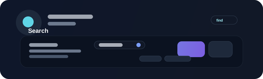
Search controls help users filter or locate items in a data-heavy interface. They are especially useful when a user is trying to find an item quickly without scanning a long list manually.
Validation Errors
Both Search and SearchBox use the shared error callback API:
#![allow(unused)]
fn main() {
UiElement::search()
    .bind(User::query)
    .error(|errors| text(errors.join("\n")))
}
Use UiElement::searchbox("Search") for the SearchBox variant. The callback
renders errors below the search control, while the accessible invalid/error
relationships remain attached to the editor. See
Error Callbacks.
Example
#![allow(unused)]
fn main() {
use bevy::prelude::*;
use beverly::prelude::*;

fn build_search(mut commands: Commands) {
    commands.spawn(BeverlySearch::new("Search files")
        .with_action("Submit"));
}
}
Guidance
Large interfaces should provide instant filtering feedback, clear empty states, and visible results count where possible. A search surface is most useful when it feels responsive and clear about what the query is matching.
Accessibility
Search inputs must have proper labels, preserve keyboard flow, and remain easy to operate in dense layouts. Empty-state messaging and result counts should be understandable even when a user is not relying on the visual emphasis alone.